
Seahawk’s First Professional Rebrand
Vision Trust, the design studio led by BeTheme designer Mateusz Madura, redesigns the Seahawk logo with designer Rafal Olbromski: the turquoise seahawk on a navy disc, the bird Seahawk still flies today.
On February 20, 2019, Seahawk’s first professionally designed logo went live on seahawkmedia.com.
Vision Trust
The redesign came from Vision Trust, the design studio led by its CEO, Mateusz Madura, whom Ryan James had met through BeTheme. Mateusz’s team member Rafal Olbromski drew the new mark. The morning it launched, Ryan messaged Rafal: “Great job on logo Rafal!”
A new address
The new logo launched on a new address. Five days earlier, on February 15, 2019, seahawkmedia.com had changed hands: the college professor who owned it was kind enough to give it to Seahawk, and the site moved over from the longer seahawkmediagroup.com. Read the full story.
Around the same time, Seahawk also tried to buy seahawk.com. The price was out of reach for Seahawk at that stage, and it still is today. It was a fun negotiation, though, and it is how Seahawk learned the domain game.
The seahawk through the years
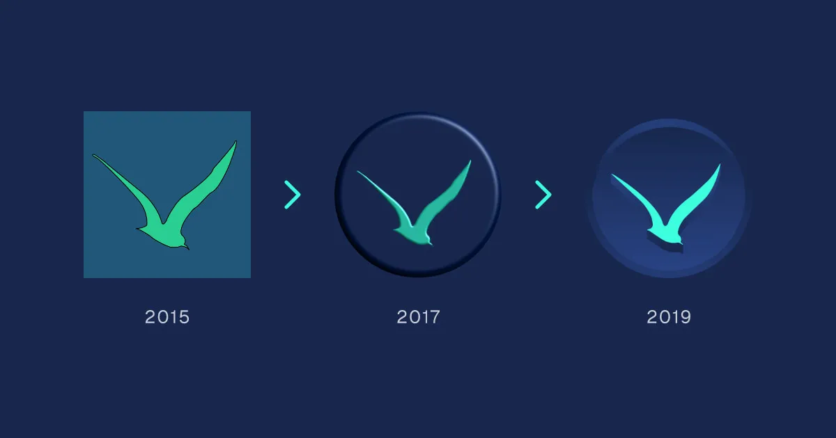
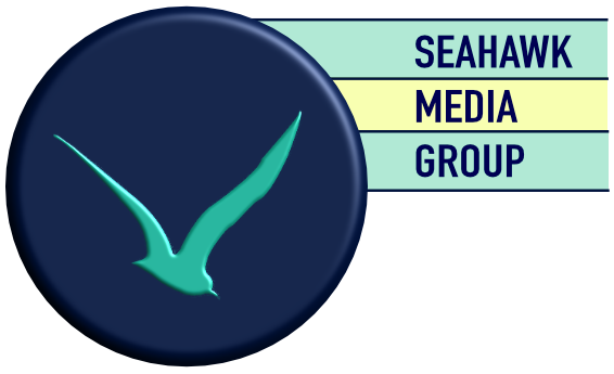
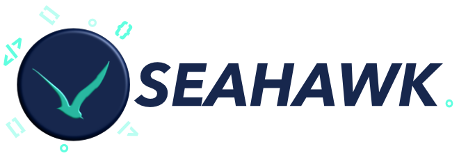
The seahawk has been the mark from day one, and it has flown four times. Seahawk Media Group’s first mark, in 2015, set a green seahawk on a blue square. By 2017 Ryan had redrawn it himself as a round navy badge with a turquoise seahawk, set beside the Seahawk Media Group name in striped bars, and in 2018 he set the badge beside a bold SEAHAWK wordmark among floating bits of code. Vision Trust’s 2019 redesign is the third: the same bird, made professional. The fourth came in November 2026 with the Seahawk Global rebrand, which keeps Vision Trust’s bird, refined for the Seahawk Design System, on a Deep navy circle.

The colors
Each version of the seahawk pushed the same two colors, a deep blue and a sea green, a little further.
- 2015: green on blue. The first seahawk was a grass green bird, outlined in black, on a flat steel blue square.
- 2017: navy and teal. Ryan’s badge darkened the blue to navy and cooled the green to a softer sea teal, then made it physical: a raised, beveled disc with a dark rim, the bird embossed into its face.
- 2019: navy and turquoise. Vision Trust kept the navy disc but made it richer and bluer, with a lighter outer ring for depth, and lifted the bird to a bright, electric turquoise that stands out on dark and light backgrounds alike. The bevel gave way to a clean, flat bird with a long shadow beneath it.
Today those colors are fixed in the Seahawk Design System as tokens: Navy (#17274D), Ocean (#284282), Navy’s partner in the Navy to Ocean gradient, and Turquoise (#3BFFDD), the color of the bird, used everywhere from the top bar of this site to the rule on every cover.
Sail with us
Building on WordPress or Astro? Let’s sail together.
Hosting companies, agencies, businesses and global brands: there’s a Seahawk crew built for each of you.